


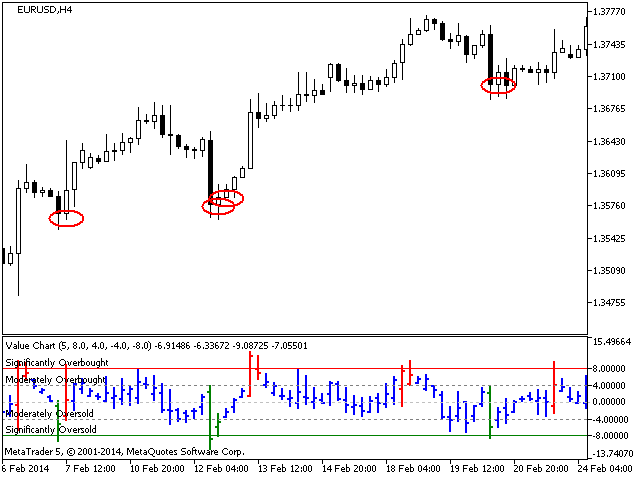

Value Charts (Helweg and Stendhal, 2002) is an innovative technology for displaying prices as a value rather than a value, even if the price volatility changes over time. It shows when a particular market is at the extreme level and the probability of a reversal is high.
Interpretation of values
The Value Chart indicator determines the market assessment, displaying the price in one of the five main assessment zones, which include:
- Significantly overrated
- Moderately overvalued
- Fair assessment
- Moderately undervalued
- Significantly undervalued
When the Value Chart indicator reaches a significant level, the color of the bar changes, indicating the possibility of opening a short or long position. The bar turns red when the financial instrument is significantly overvalued (the possibility of opening a short position) and green when it is significantly undervalued (the possibility of opening a long position).
Example of a trading strategy
As a rule, in bull markets, there are quick, sharp pullbacks, followed by a slow, diligent upward movement. As part of this strategy, we use the Value Chart values to determine the time rollbacks.