


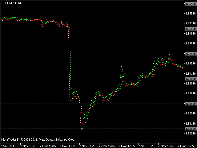

An alternative representation of the price chart – a time series-on the screen.
Strictly speaking, this is not even an indicator, but just a visual interpretation of prices, along with the generally accepted ones – bars, candles, and a line.
Currently, when analyzing and trading, I use only such a representation of the price series in the form of graphs.
Here you can clearly see the weighted average value of the price (as if the center of gravity of the time interval) and the range of the spread up/down. The point is (Open High Low Close) / 4, the upper dotted line is High, the lower dotted line is Low.
The acceleration/deceleration of the price, the uniform rise/fall of the price, various types of outliers with the removal of stops, chaotic throwing and range/flat sections are clearly and clearly visible. All this can be seen on the candle view, but, in my opinion, the proposed view is more visual for the visual perception of a person.
The following values are displayed:
- Weighted average price – as a point.
- The High price value is shown as a dotted line above the point.
- The Low price value is shown as a dotted line below the point.
- “Round” price levels – in the form of dotted lines.
External set parameters:
[spoiler title=”Read More…”]
- Points Size – the size of the point (set one of two options – small/large).
- Show Time Scale-enable / disable the display of the time scale on the current chart (Fig. 2).
- Show Price Scale-enable / disable the display of the price scale on the current chart (Fig. 2).
- Show Round Levels-enable / disable the display of “round” price levels.
- Round Levels Step in Points – the step between adjacent “round” levels in points-is usually set as a multiple of 500.
- Up